Filters and colour
5 topics from the in-app manual.
Using filters without ruining the photo
Rule: change one thing at a time
Stack several filters at once and you will never know which step ruined it.
Suggested order
1. Auto beautify (exposure and white balance as a base)
2. Brightness and contrast (only if still needed)
3. Hue and saturation (for colour casts)
4. Clarity or soften (finishing touch)
How to judge
Shrink the result to phone size and look at it. If it still holds up small, it is fine.
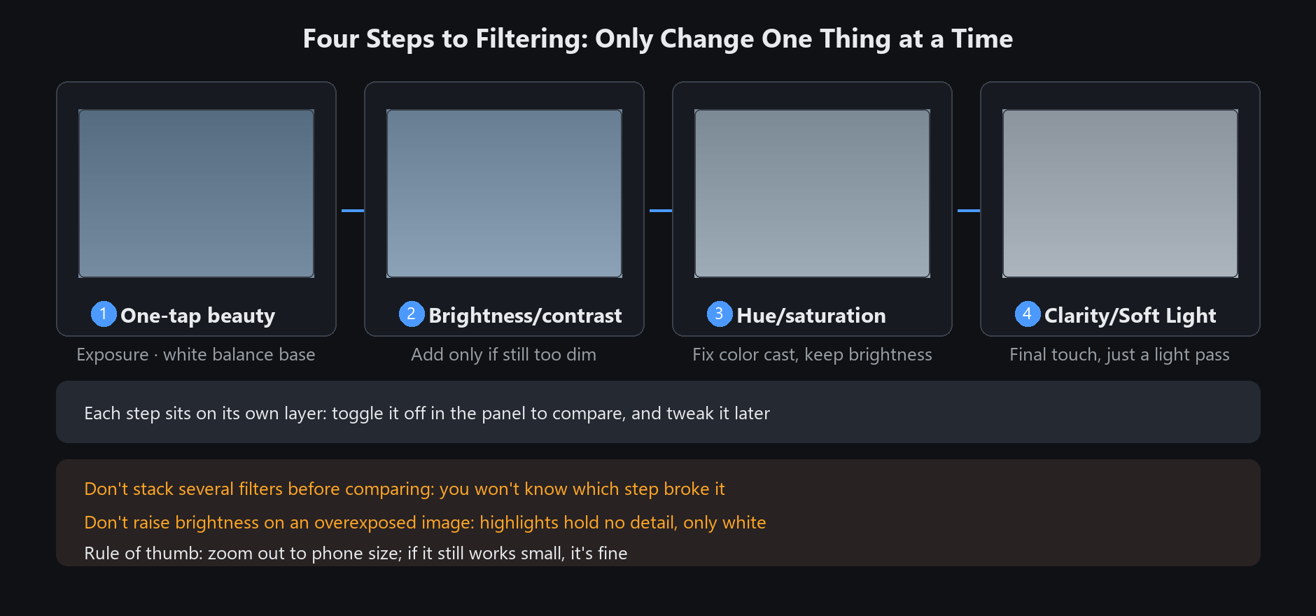
Filters land on their own layer, so you can retune them or switch the whole layer off. Experiment freely
A few counter-intuitive filters
Focus blur / spotlight: act outside the painted area. Where you paint stays sharp
Desaturate: removes colour only where you paint; everything else is untouched
Soften: softens highlights, making skin look finer. Overdo it and the whole photo turns mushy
Clarity: adds midtone contrast, it is not sharpening. Stacking it with sharpening produces white halos
Focus blur and spotlight preserve the painted area; desaturate does the opposite and affects only that area.
Test a short stroke before covering a large region
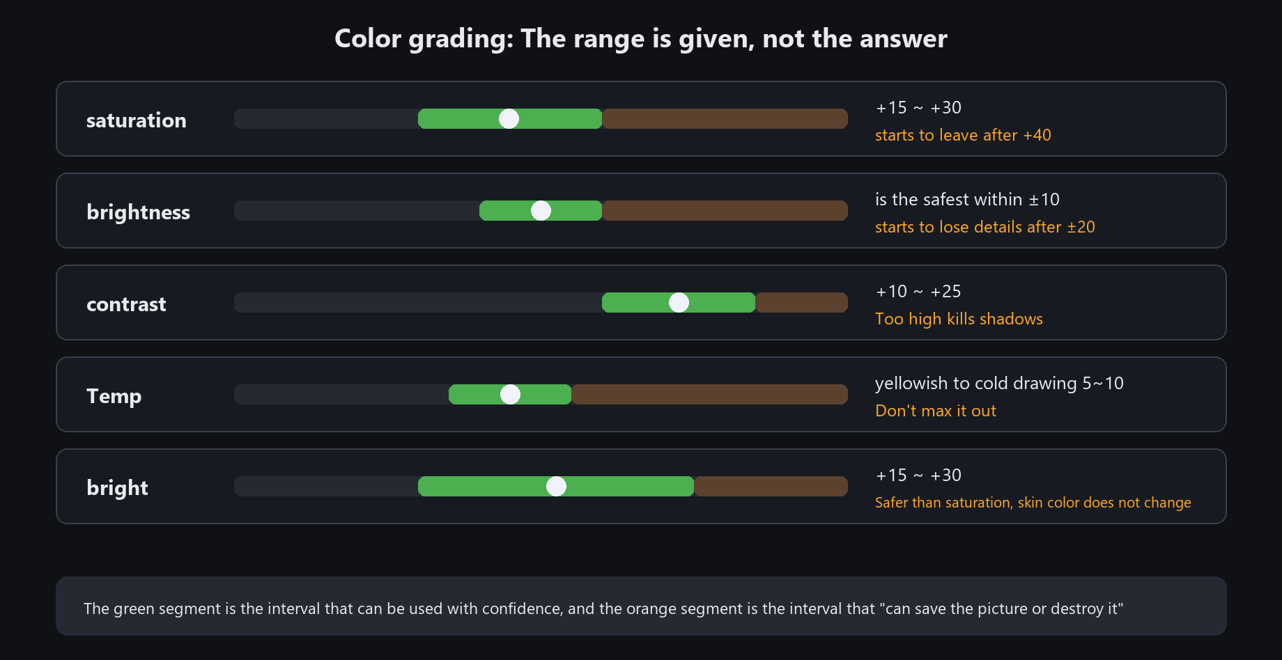
Colour adjustment values that work
Saturation: find the feel between +15 and +30. Past 40 it starts to look fake
Brightness: within ±10 is safest; past 20 detail starts to go
Contrast: +10 to +25
White balance: pull a yellow photo 5~10 toward cool, never all at once
Vibrance: lifts only low-saturation colours, leaving skin and lipstick alone. Safer than saturation
Do not raise brightness on an already blown-out photo — pull the highlights down first.
Blown highlights carry no detail, so brightening only gives you a white patch
Smart colour vs auto beautify
Smart colour: analyses the frame and proposes a scheme. Leans toward "grading"
Auto beautify: exposure, contrast, white balance, vibrance and clarity at once. Leans toward "rescuing"
Which to pick
Flat, dark or colour-cast photo → auto beautify
Photo is fine, you want a style → smart colour
Try both and keep the better one. They are on separate layers anyway
Do not run auto beautify on a photo you already graded by hand — it pulls your grading back toward average
Both have checkboxes to disable individual steps. Unticking "clarity" in auto beautify,
for instance, makes the result noticeably more natural
Black and white, and colourising
Converting to black and white
Do not just drop saturation — that gives grey, not black and white.
Use the black-and-white filter, which redistributes greys by the luminance of each colour: skies go darker, skin goes brighter.
Colourising a monochrome photo
Portrait → Photo restore → Colourise. AI does it automatically in about five seconds (the first run loads the model).
Colouring line art
First use "fill inside" to make the closed line art opaque, then colour — otherwise paint leaks outside the lines.
Push the monochrome contrast a little before colourising; the AI judges better that way