Every tool in the toolbar
10 topics from the in-app manual.
Toolbar: 16 cells, 57 tools
See the structure first
The toolbar on the left has 16 cells. Five hold a single tool; the other 11 carry a small
orange triangle in the corner — click that triangle (or press and hold) to open a whole group.
How many in each group
Selections (6): rectangular, elliptical, lasso, magic wand, magnetic lasso, polygonal lasso
Shapes (10): rectangle, rounded rectangle, ellipse, triangle, hexagon, polygon, star, line, pen, hand-drawn emphasis
Buckets / gradient (8): bucket, gradient, crayon, pencil, watercolour, ink, gradient crayon, gradient watercolour
Erasers (4): eraser, soft-edge eraser, smart speck eraser, smart repair
Retouch (8): fine blur, wide blur, blend, dodge, burn, sharpen, saturate, desaturate
Text 3, annotation 4, vector brushes 2, clone (A/B) 2, direct select 2, local effects 3
Five with no flyout: move, pan, pixel brush, crop, screen eyedropper
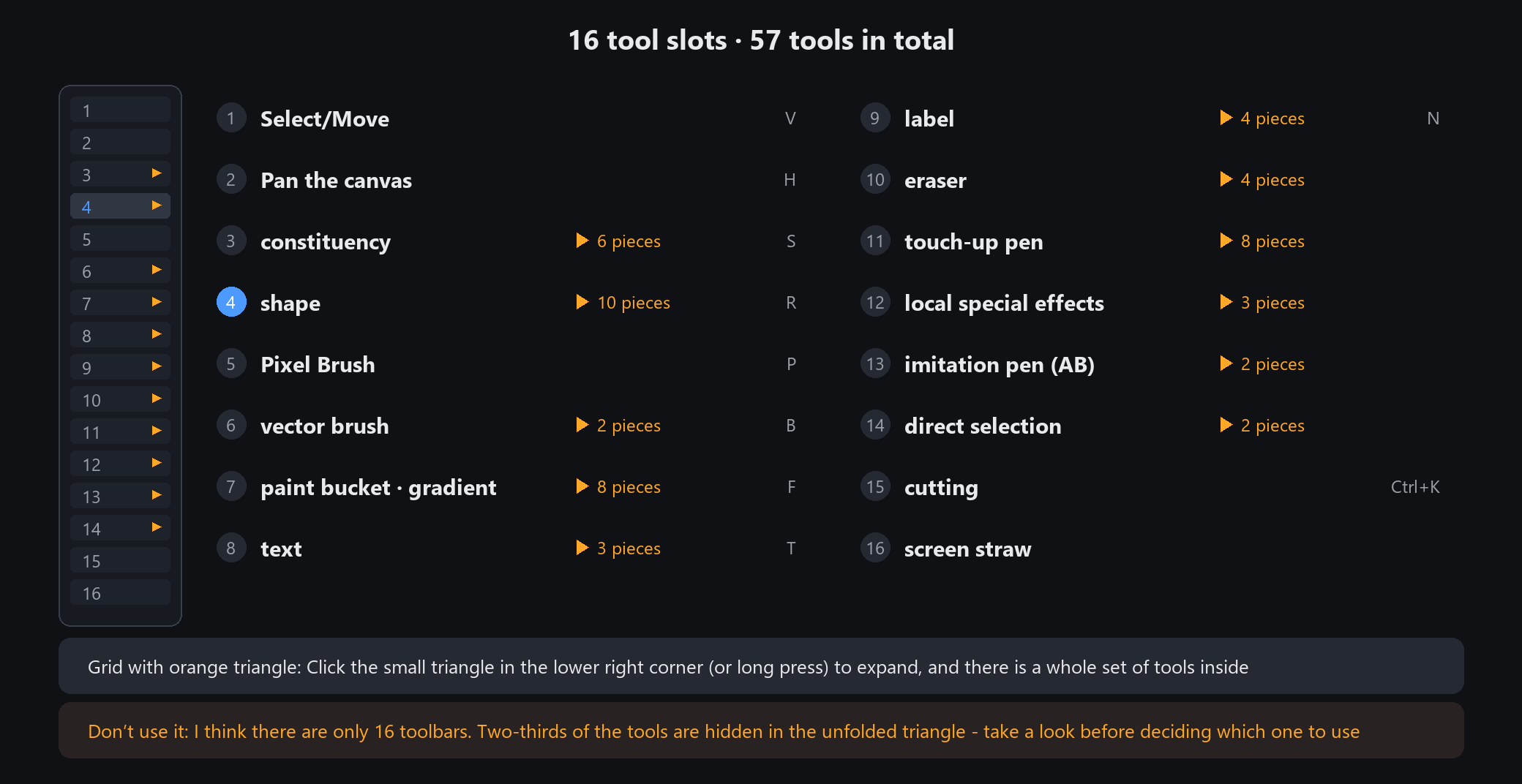
Hovering any cell shows its name and shortcut. The letter in brackets (R, E, A, L, M, G) is the key
Move, pan and the screen eyedropper
1. Move (V)
Click to select whatever you clicked; drag to move it. It selects the layer under the cursor
automatically, so you never have to hunt for it in the layer panel. Click empty space to deselect.
2. Pan (H)
Moves your view only — nothing in the image changes. Hold Space to pan temporarily; releasing returns you to the previous tool.
3. Screen eyedropper
Click anywhere on screen to read one pixel's colour, and it goes straight to the foreground or the selected element.
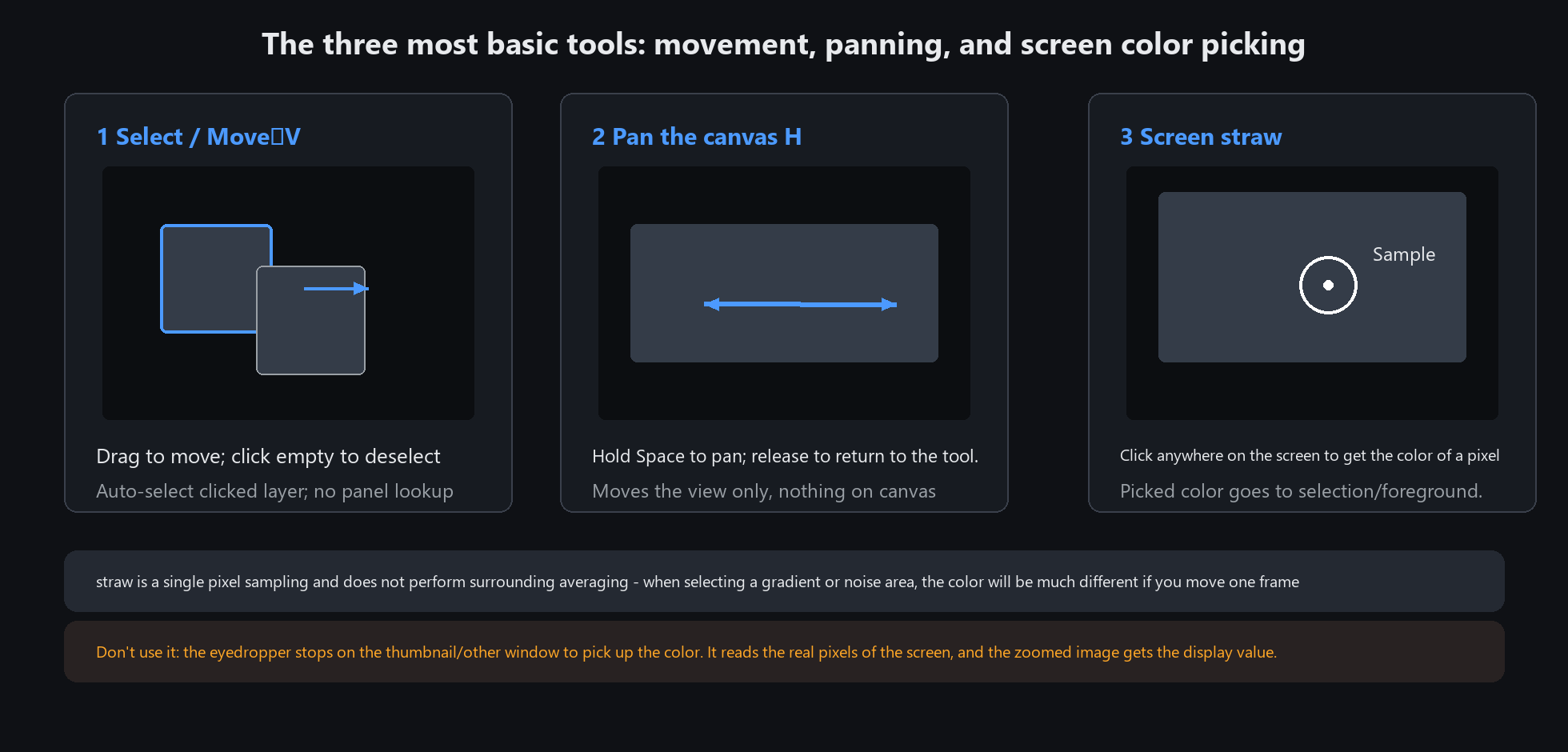
The eyedropper reads a single pixel with no averaging. On gradients or noisy areas, one pixel makes a big difference
Do not use it on thumbnails or other windows. It reads real screen pixels, so a zoomed view gives you the displayed value, not the original
Shape group: drawing all ten shapes
Three keys while drawing
Hold Shift: square / perfect circle / equilateral triangle, and lines snap to multiples of 15 degrees
Hold Alt: draw outward from the centre instead of from a corner
Afterwards, tune it in the property panel: fill colour, stroke colour, stroke width, corner radius, opacity
Filled by default: the fill follows the foreground colour in the top bar — pick a new colour and the next shape fills with it;
drag the fill slider to 0 (or right-click the fill swatch) to go back to outline-only
Notes on each of the ten
Rounded rectangle: the corner radius is its own control. Use it for buttons and card backgrounds
Polygon: click point by point, then click back on the start point to close
Star: both the number of points and the inner radius ratio are adjustable — good for rating stars and badges
Pen: click to add an anchor, drag to pull out a curve, then click the start point or double-click to finish
Hand-drawn emphasis: drag an ellipse, and on release it becomes a hand-drawn-looking circle —
better than a shaky hand-drawn oval when marking up screenshots, and less stiff than a perfect ellipse
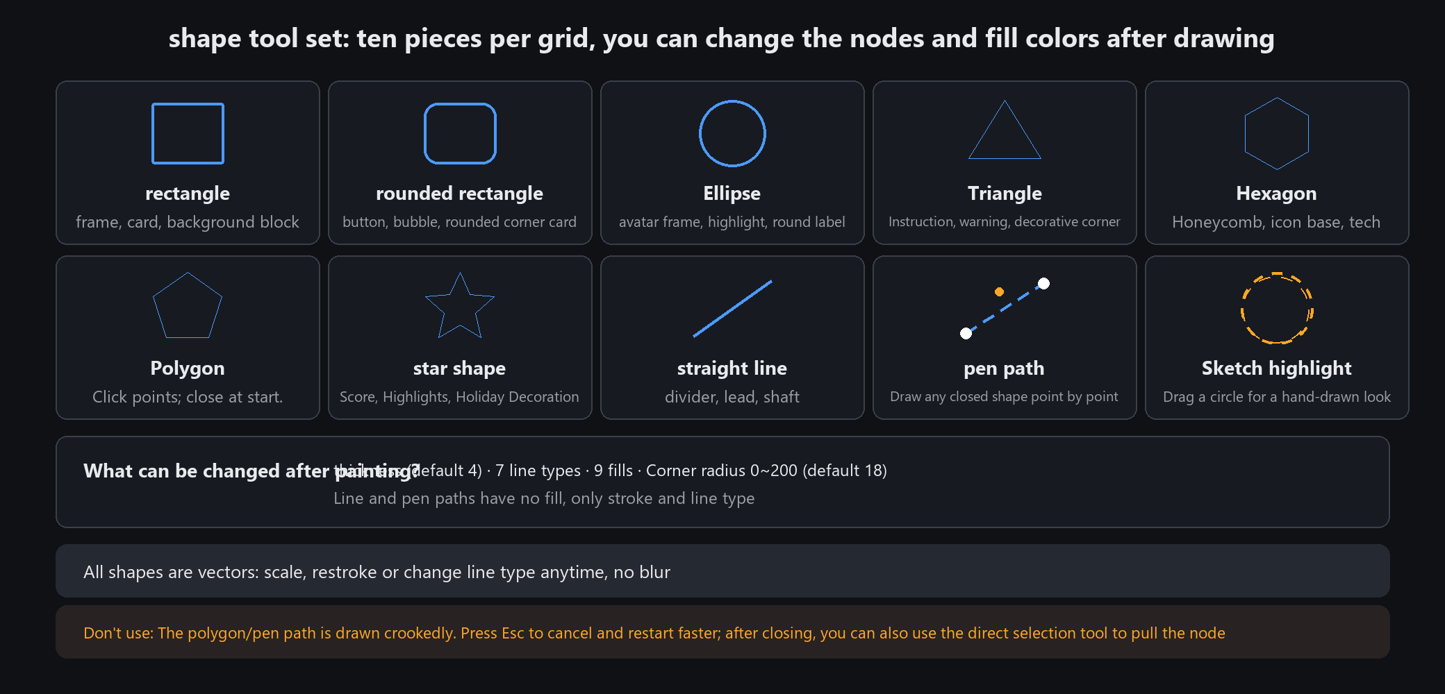
Shapes are vector elements: afterwards you can edit nodes, width and colour with the direct-select tool, and scale without quality loss
Do not use shapes for the main subject of an illustration. They are regular geometry — draw characters with a brush
Text: horizontal, vertical, art text
Which of the three
Horizontal: ordinary layout. Headings, captions, watermarks
Vertical: characters stack downwards and columns run right to left. For Chinese classical, poetry or seal-style layouts
Art text: horizontal text with an outline and decoration. Cover titles and poster headlines
What the property panel offers
Font, size, bold / italic, colour, line spacing, letter spacing, alignment, outline and shadow.
How to use it
Pick the tool, drag a box on the canvas to define the text area, then type. The box width decides where lines wrap.
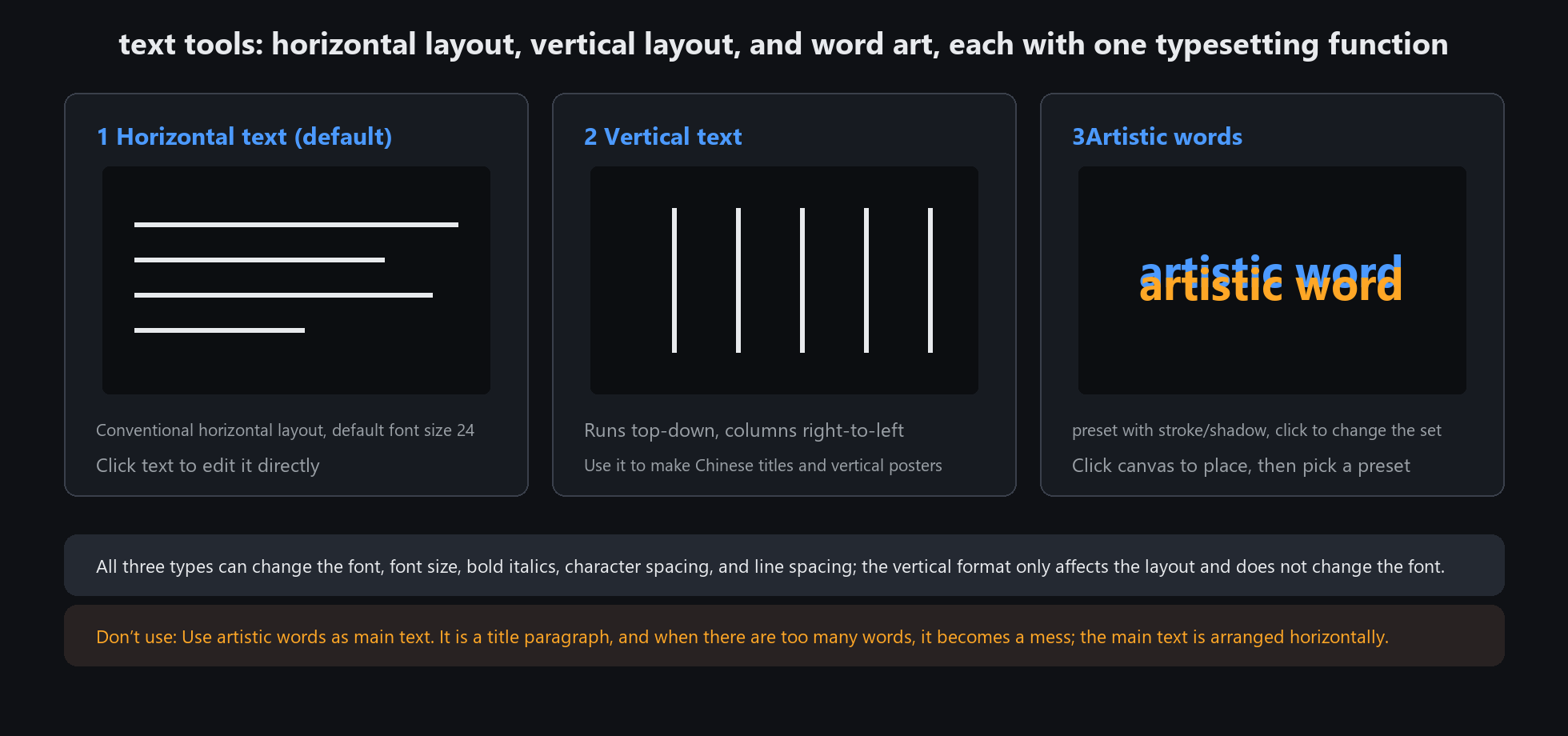
Text stays vector: double-click any time to change the words or the size, with no quality loss
Do not use vertical text for long paragraphs. Columns run right to left, and past thirty or forty characters it gets tiring to read
Annotation: arrow, number badge and two mosaics
1. Arrow (A)
Drag a line; each end can have its own arrowhead. Width, colour, arrow style and size are all adjustable.
2. Number badge (N)
Click to drop a numbered circle on a filled disc. The number increments automatically. Ideal for step-by-step diagrams.
Both the disc colour and the number colour can be changed.
3 and 4. Two mosaics
Pixel mosaic (M): the classic blocky grid. Obviously censored at a glance
Blur mosaic (G): gaussian blur. Unreadable but not harsh, for places that must be hidden without looking ugly
Both have an adjustable brush size.
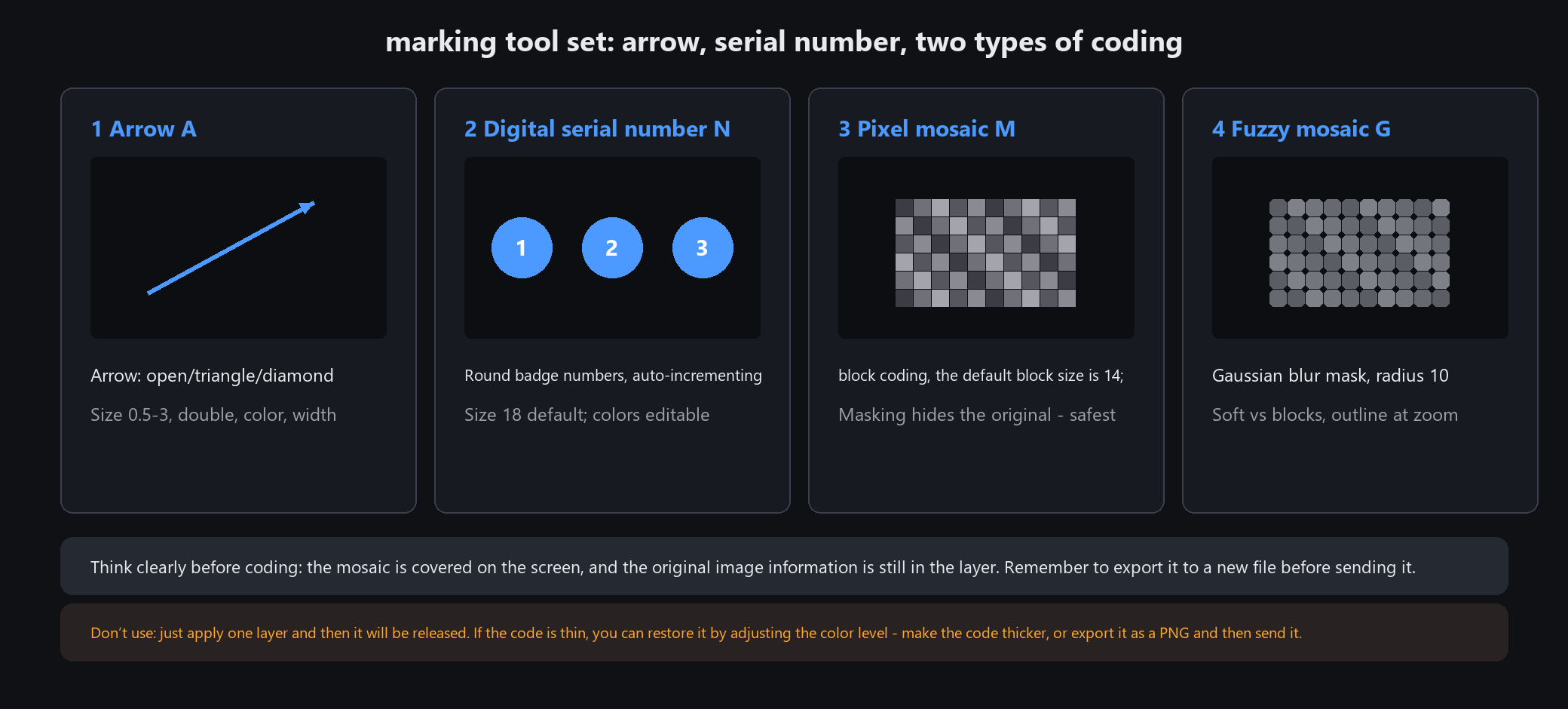
For anything that must stay hidden, use pixel mosaic and lay it on thick — a blurred area can sometimes be recovered by raising contrast
Do not use mosaic as a painting brush over large areas. It only occludes; heavy coverage looks bad
Two erasers: hard edge and soft edge
Eraser (hard edge)
What you scrub is what goes, with a crisp boundary. For trimming shape edges and clearing small patches.
Soft-edge eraser (fades out)
The edge fades outward, so no hard ring is left behind. For tidying fur after a cutout and removing shadows.
Both share these controls
Size, hardness (soft-edge width), and opacity / flow.
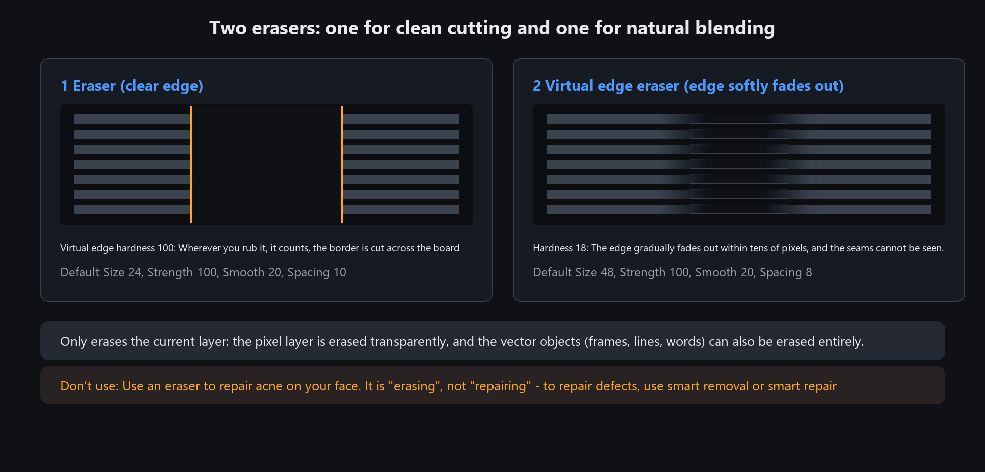
Erasing only affects the current layer: pixel layers go transparent, and vector objects (boxes, lines, text) can be removed whole
Do not expect transparency on the background layer — it reveals the background colour. Convert it to a normal layer first if you need a hole
Eight retouch brushes: blur, light, saturation
Three blur brushes
Fine blur: small radius. Skin flaws and tiny unwanted details
Wide blur: large radius. Backgrounds and whole areas
Blend: smooths the seam between two very different colours
Two light brushes
Dodge: brightens what you paint. Adding a touch of highlight
Burn: darkens what you paint. Shadows and contours
Clarity and saturation
Sharpen: bring out detail locally. Do not paint the whole image with it
Saturate / desaturate: local vibrance — keep the subject lively and let the background go grey
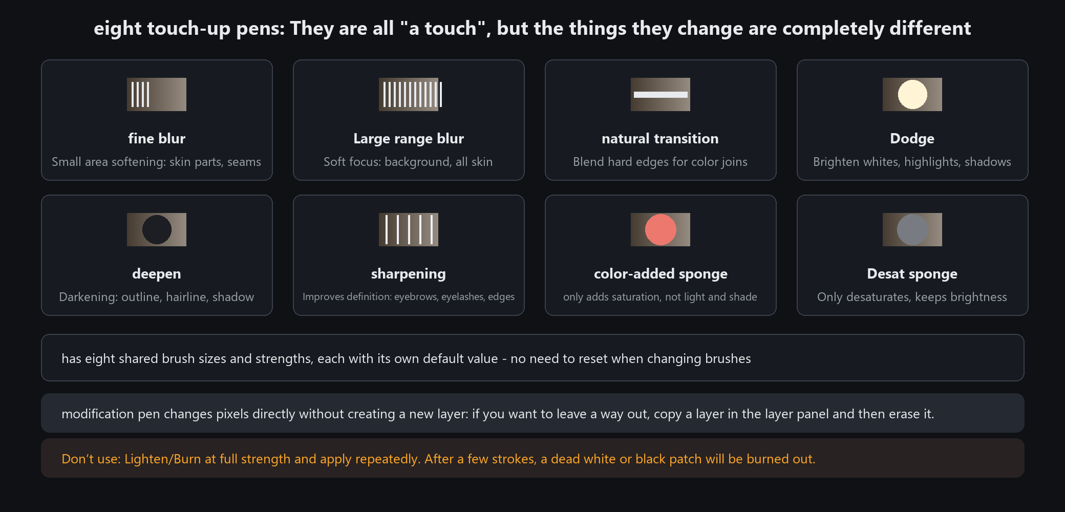
Retouch brushes edit pixels directly and create no layer: duplicate the layer first if you want a way back
Do not scrub back and forth at full strength. All eight accumulate; a few passes and the image is ruined. Undo and redo instead
Local effects: focus blur, spotlight, desaturate
What each one does
Focus blur: what you paint stays sharp and everything around it blurs — a fake fast lens
Spotlight: what you paint keeps its brightness and the surroundings darken — pushing the eye to the subject
Desaturate: what you paint keeps its colour and the rest turns grey — subject in colour, environment grey
The key: you paint the protected area
It works backwards from everything else — where you paint is where nothing happens. Want the person sharp? Paint them in fully.
Parameters
All three have a strength slider you can still change afterwards, and all three can be undone and repainted.
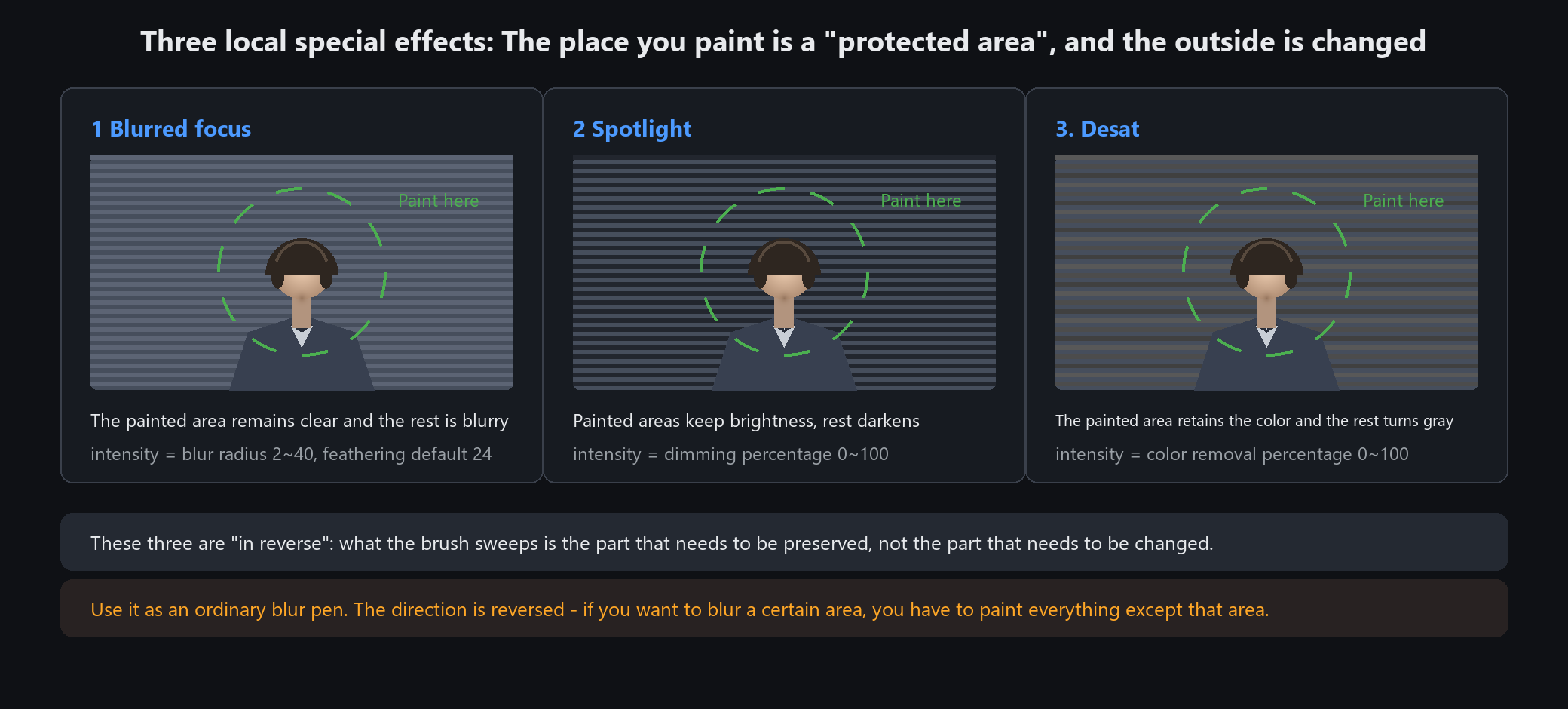
Paint the subject's outline carefully. Anything outside stays sharp with it; anything you miss gets blurred away
Do not stack all three. Focus blur plus spotlight plus desaturate at full strength looks like a cheap poster
Gradient tool: choosing among five
The five types
Linear: one straight direction. The most used — skies, background panels
Radial: spreads from the centre outwards. Glows and spotlights
Angular: sweeps around the centre. Fans and halos
Reflected: mirrored either side of the centre line. Metal reflections, cylinders
Diamond: from the centre towards the four corners. Diamond highlights
How to use it
Drag a line: the start is the beginning of the gradient, the end is its finish, and the length decides how gradual the transition is.
Short drag means an abrupt change; long drag means a gentle one.
Colours
One stop at each end, and both support transparency (transparent stops show as a checkerboard).
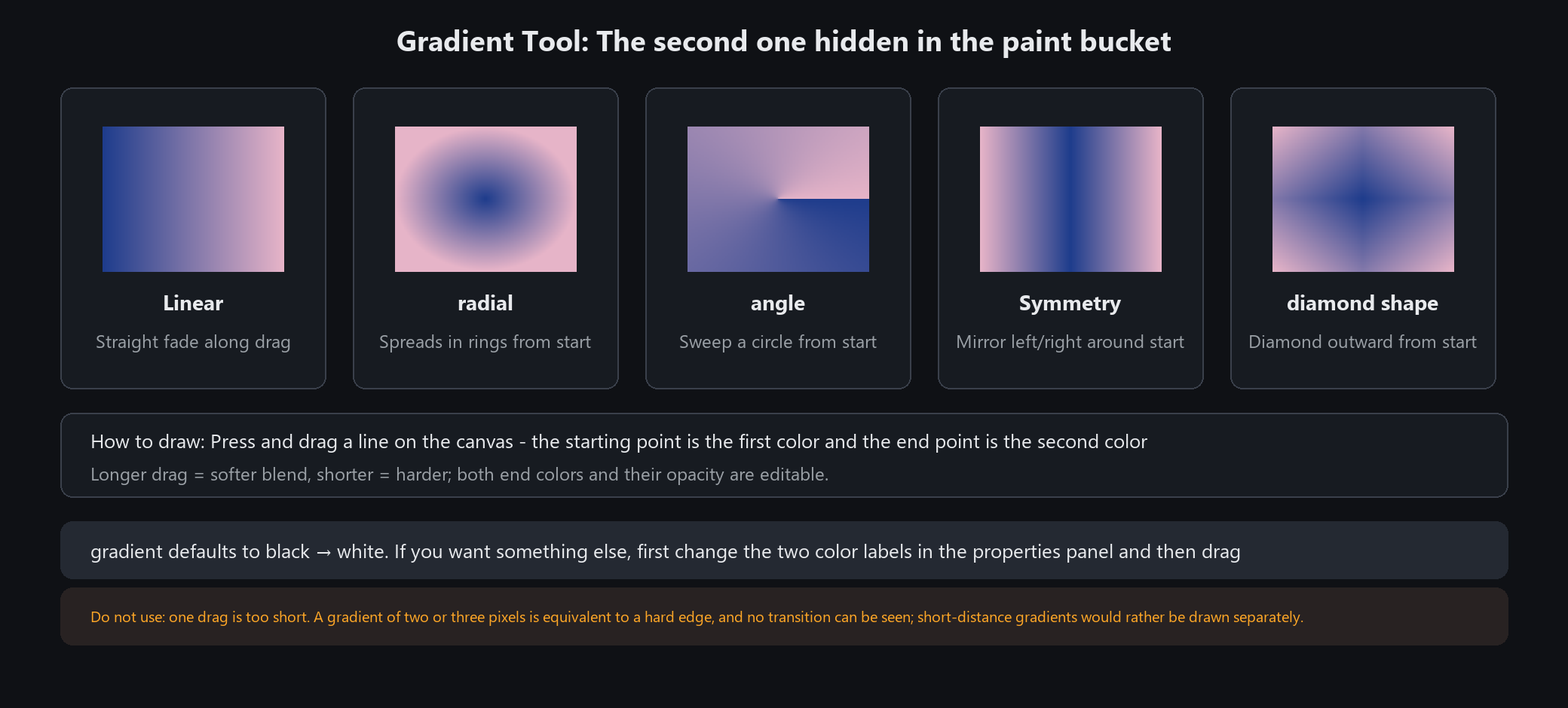
The gradient shares a cell with the bucket. Use the small triangle at the corner to switch
Do not paint it straight over the image. A gradient covers everything beneath — put it on its own layer and lower the opacity if you want it as atmosphere
Direct select: fixing a line you drew wrong
What it can edit
Vector elements: shapes (rectangles, polygons, stars), pen paths, arrows, text frames and vector strokes.
Not pixel strokes — those are colour, with no points to pull.
Four operations
Drag an anchor to reshape. Square anchors are nodes; round ones are Bezier handles
Drag a handle to change the curvature of that segment (only the curve sub-tool shows them)
Click anywhere on the line to insert a new node
Change properties once selected: width, colour, line style (7), end arrowhead, tapered tail
Two sub-tools
Open the flyout for "straight" and "curve": inserted nodes stay straight with the former and come out smoothed with the latter.
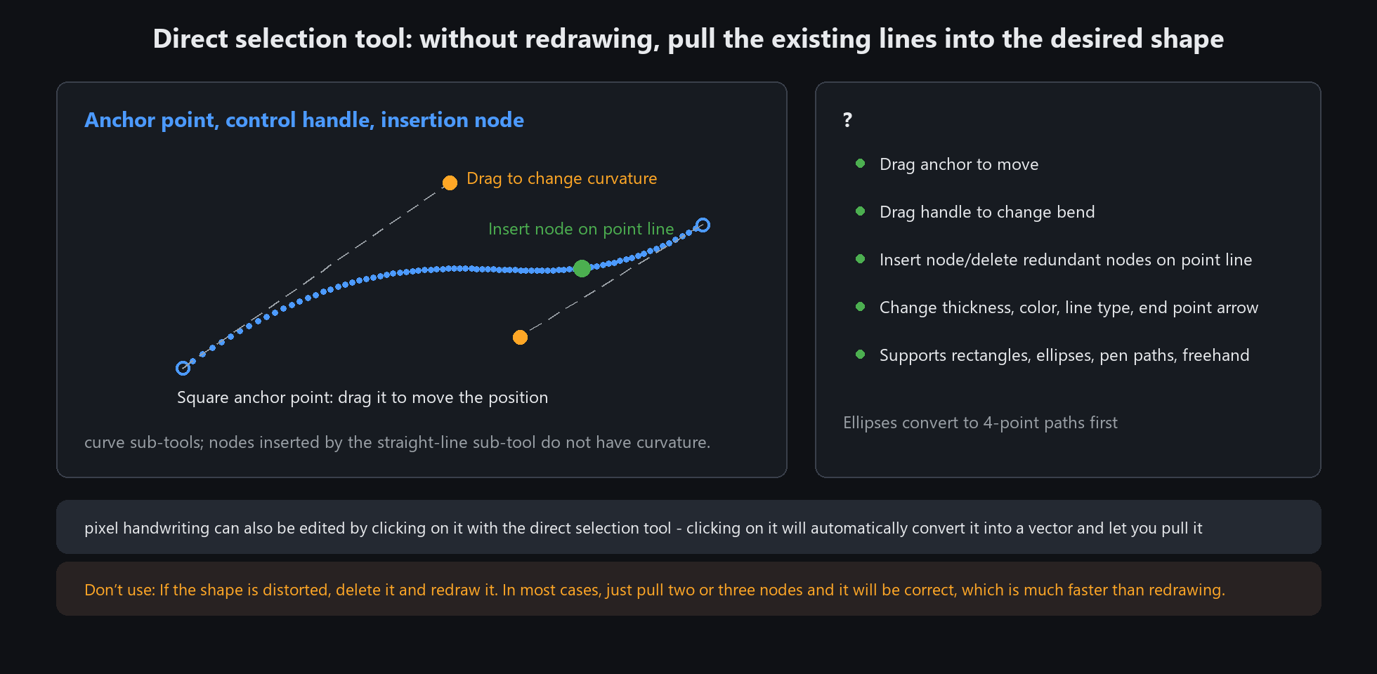
This is the whole point of vectors: you can still fix it afterwards. A wobbly pixel stroke must be undone and redrawn; a vector line can be pulled back
Do not expect it to edit pixel strokes. To change one, select it and convert it to a vector stroke first