Feature 4 · Eight buckets
6 topics from the in-app manual.
Nine buckets for different materials
The bucket button in the toolbox has a small triangle. Press and hold it to open nine options:
1. Paint bucket (shortcut F): solid colour
2. Gradient: five types (linear / radial / angular / symmetric / diamond)
3. Crayon bucket: fills with crayon strokes
4. Pencil bucket: fills with coloured-pencil hatching
5. Watercolour bucket: with pigment settling at the edges
6. Ink bucket: ink tones
7. Oil paint fill: continuous pigment with separate height for bristle texture and raised edges
8. Gradient crayon bucket: gradient plus crayon texture
9. Gradient watercolour bucket: gradient plus watercolour feel
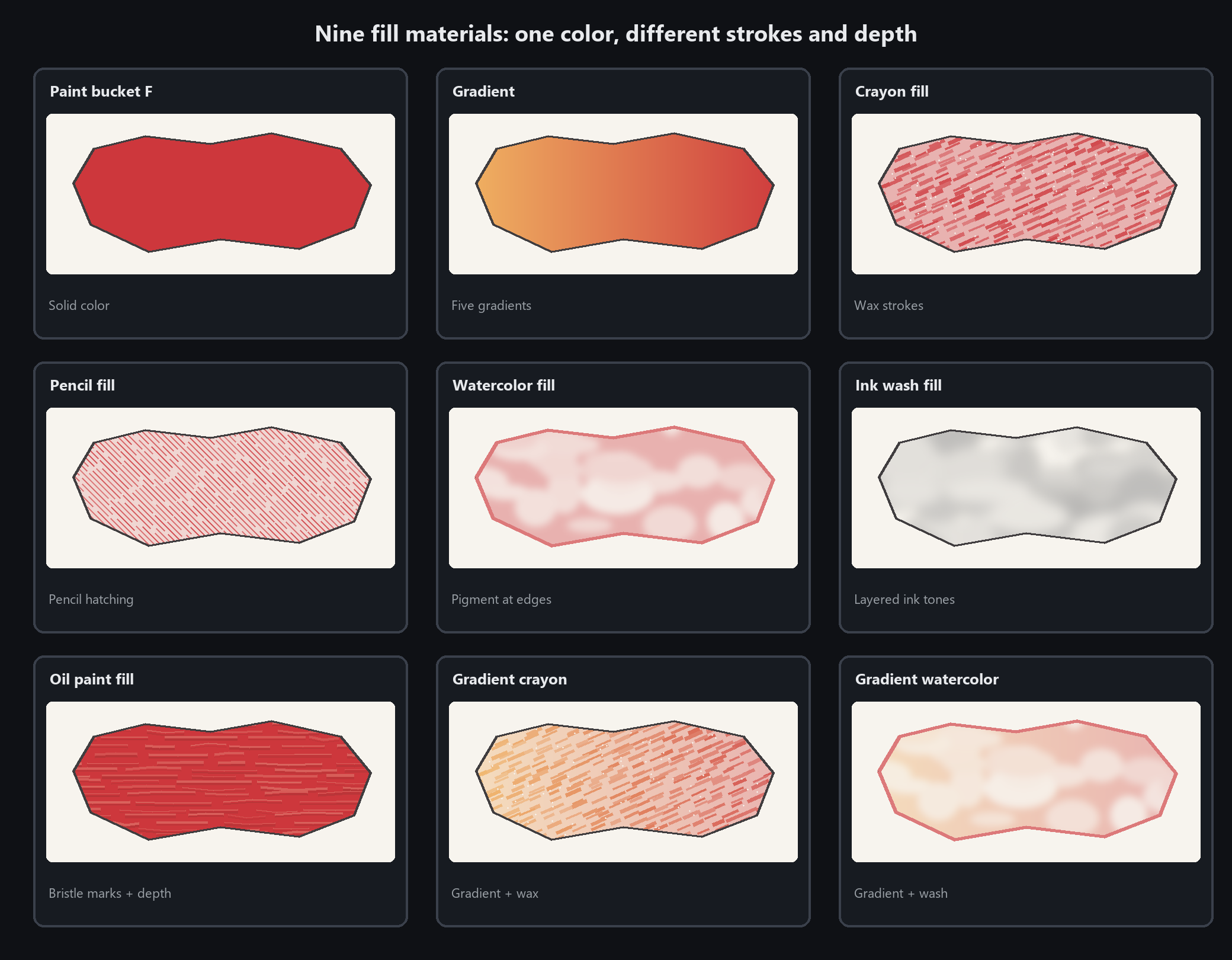
Set Paint Thickness from 0 to 100: higher values raise the paint while local relief stays varied. New fills get different texture; adjusting a selected fill keeps its pattern. WCI projects retain the height data
Plain bucket: tolerance is everything
How it decides where to fill
With a closed shape (rectangle, ellipse) under the cursor: fills the inside directly, ignoring tolerance
With no shape: flood fills by tolerance — starting from the clicked pixel, it spreads to similar colours
With a selection: fills only inside the selection
Setting tolerance
There is a slider in the right panel, default 12.
Filling inside line art (pure black on white): raise to 30~50, or a white rim stays along the lines
Filling one colour inside a photo: 10~20. Higher and it leaks elsewhere
Anti-alias
Tick it for softer fill edges. Always tick it when colouring line art.
A white rim after filling usually means tolerance is too low. Try 32 — that normally fixes it
Gap closing and white-rim fix
Line art full of small breaks that leak colour? These two settings exist for exactly that. Find them under
menu Edit → Software settings… → Paint bucket. Saved on this machine, they apply to every later fill.
Close small gaps (default 4 px, range 0–12)
Before filling, the app first bridges breaks narrower than this value, then fills — small gaps no longer leak
0 turns it off; a break wider than the value still leaks — patch it with a brush first, then fill
Do not push it high: above 6–8 it may bridge two neighbouring lines and flood the wrong area
White-rim fix (default 1 px, range 0–2)
A thin white rim often remains where the fill meets the black line. This value lets the colour seep
1–2 px under the line and swallow the rim
0 turns it off. Keep it on if you see white seams between fill and line when zoomed in
Three more on the same page
Default tolerance: the bucket tolerance for new documents (default 12, range 0–255)
Hover preview: see which area will fill before you even click
Default anti-alias: softer fill edges. Keep it ticked for line-art colouring
Keep the defaults 4 / 1 unless you have a reason — they suit most line art. When colour leaks, suspect the gap itself before raising the closing value
Gradient bucket: choosing among five
How to use
Pick the gradient tool, drag from one point to another and release. Direction and length set the gradient.
The five types
Linear: the everyday one, along a straight line
Radial: spreading from the centre outward. Glows, spheres
Angular: sweeping around the centre. Discs, rainbow wheels
Symmetric: mirrored from the start point in both directions
Diamond: outward along a diamond outline. Diamond highlights
Editing colours
The gradient bar at the bottom of the panel is the stop editor. Click a stop to pick its colour,
double-click the bar to add one, drag to move it, and use reverse and delete.
For a sky: linear or radial both work. Keep it to three colours or fewer; more turns muddy
Crayon bucket: four sliders decide if it looks right
The crayon bucket does not fill a flat colour — it lays a layer of directional crayon strokes. Four sliders:
Coverage: how much the wax hides what is beneath. 100 is solid; around 60 lets paper grain show
Grain: the tooth of paper and wax. Raise it for a coarser look
Stroke length: how long one wax mark is. Short reads crumbly, long looks swept
Stroke width: how wide one mark is
Do not miss the dial
Below the sliders is a dial. Drag it to set the direction the crayon is dragged. Every stroke points the same way —
that is how people actually colour with a crayon. Mixed directions read as fabric texture, not crayon.
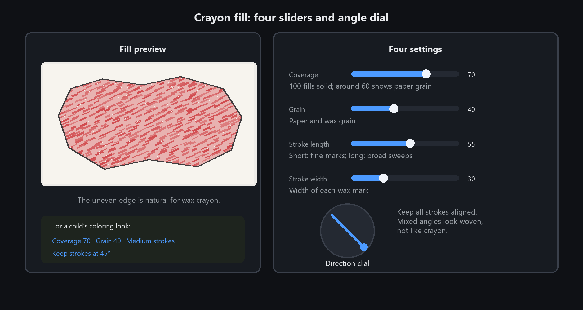
For a child's colouring look: coverage 70, grain 40, medium stroke length, a single 45-degree direction.
Edges that are not fully covered are correct — a crayon never reaches the very edge
Picking between pencil, watercolour and ink buckets
Pencil bucket
Fills with hatching — you can see individual strokes. It has a hatch-density slider.
For: sketchy illustration, journals, product sketches.
Watercolour bucket
Pigment settles into a darker rim at the edge (the way real watercolour dries), with an uneven wash inside.
For: hand-painted illustration, picture books, postcard style.
Ink bucket
Varying ink density with a bleeding edge.
For: Chinese style, freehand ink, ink posters.
Gradient versions (gradient crayon / gradient watercolour)
Gradient plus the matching texture. Use these when you want a gradient with a hand-made feel.
A quick rule: look at what brushes the rest of the picture uses. Match the bucket to the brush.
Crayon drawing with crayon bucket, watercolour with watercolour bucket — mixing them clearly clashes